> ## Documentation Index
> Fetch the complete documentation index at: https://docs.saasio.io/llms.txt
> Use this file to discover all available pages before exploring further.
# Working with State & Conditions
> Learn how to make your application interactive by storing data in State variables and using Conditions to dynamically change your UI.
***
So far, you've learned how to build a beautiful, static interface. Now, it's time to make it intelligent and interactive. This is done using two core features: **State** and **Conditions**.
* **State:** Think of State as the temporary memory for your page. It's where you store data that can change, such as user input, loading indicators, or data fetched from an API.
* **Conditions:** Conditions allow your UI elements to react to changes in State. They follow a simple "IF-THEN" logic: IF a certain condition is true, THEN change an element's appearance or value.
Mastering these two concepts is the key to building a dynamic application instead of just a static website.
***
## Part 1: Storing Data with State
A "state variable" is a container for a piece of data. In Saasio, states are always attached to a specific context: either to a UI element on a **Page** or to the **API Route** itself.
### State on a Page
On a page, states are scoped to an element. This means you first select the element that will "own" the state, like a container or the main body of the page.
First, select the element that will hold your state variable. For page-wide states, it's common practice to select the top-level **`Body`** element in the **Layers** panel.
With the element selected, go to the left panel and click on the **States**
tab. This will show a list of all state variables attached to that element.
Click the **`+`** icon to open the "Create State" dialog.
#### Configuring Your State Variable
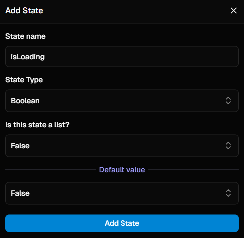
After clicking the `+` icon, a dialog will appear. Here’s a breakdown of each field you need to configure:
A descriptive, user-friendly name for your variable (e.g., `isLoading` or
`userList`).
The type of data this variable will hold. This can be:
* A **simple type** like `Text`, `Number`, or `Boolean`.
* A **Data Table** (e.g., `Users`) for storing complex objects.
* An **Option Set** for storing a value from a predefined list of choices.
Defines if the state holds a single value or a list of values. This defaults
to `false`.
The initial value when the page loads. This should match the data type (e.g.,
`false` for a Boolean, or empty for a list).
#### Configuration Examples
Here’s how you would configure two common types of state variables:
This state holds a single `true` or `false` value, perfect for tracking a loading status.
* **Name:** `isLoading`
* **Data Type:** `Boolean`
* **Is List?:** `false` (or leave as default)
* **Default Value:** `false`
This state holds a list (or array) of complex data from your `Users` table.
* **Name:** `userList`
* **Data Type:** Select `Users` from the Data Table dropdown.
* **Is List?:** `true`
* **Default Value:** (leave empty to start with an empty list)
### State in an API Route
In an API Route, states are attached globally to the route itself, as there is no UI. The process is simpler:
1. With your API Route open, navigate to the **States** tab in the left panel.
2. Click the **`+`** icon and configure your state variable using the same properties described above.
 *You have now created a piece of memory for your page or API route that can be
updated by workflows and used in your logic.*
***
## Part 2: Displaying State in Your UI (Data Binding)
You can "bind" an element's property to a state variable, so it always displays the current value.
For example, to display the value of a state variable in a text element:
1. Select the **Text** element on your canvas.
2. In the **Properties Panel** (right side), find the `Display` property.
3. Change its value from "static text" to **"state"**.
4. In the `Data source` field that appears, select your desired state variable.
The text element will now dynamically display the current value of that state.
***
## Part 3: Using Conditions to React to State
Conditions allow elements to change their appearance or content when your state changes. Let's make a "Submit" button change its text to "Saving..." when our `isLoading` state is `true`.
First, select the element you want to change. In this case, it's the **Text element** that is *inside* our button.
In the **Left Panel**, navigate to the **Conditions** tab.
Click the **`+`** icon to add a new condition. A configuration panel will appear. Here, you define a rule that checks if something is true, and then specify how the element should change in response.
#### 1. Define the Condition
First, you must define the logic. In the **`condition`** section, build a dynamic expression that results in a `true` or `false` value.
*Example: To track a loading state, you would select the `isLoading` state variable and add an operation to check if its value is equal to `true`.*
#### 2. Configure the Changes (When the Condition is True)
Next, you specify how the element should look or what it should contain **only when the condition you just defined is true**.
{" "}
When the condition is `false`, the element automatically reverts to its
original, default properties and styles. You do not need to define a "false"
state.
You can make two types of changes:
* **Change the Primary Value:**
In the `properties` section, you can override the element's main content. For our text element, you would set the `values` property to the new text you want: "Saving...".
* **Change the Style:**
In the `styles` section, you can add one or more CSS style overrides. For example, you could change the button's `backgroundColor` to a muted grey to show it's in a loading state.
Now, whenever the `isLoading` state becomes `true`, the button's text will automatically change to "Saving...". When it becomes `false`, it will revert to its original state.
*You have now created a piece of memory for your page or API route that can be
updated by workflows and used in your logic.*
***
## Part 2: Displaying State in Your UI (Data Binding)
You can "bind" an element's property to a state variable, so it always displays the current value.
For example, to display the value of a state variable in a text element:
1. Select the **Text** element on your canvas.
2. In the **Properties Panel** (right side), find the `Display` property.
3. Change its value from "static text" to **"state"**.
4. In the `Data source` field that appears, select your desired state variable.
The text element will now dynamically display the current value of that state.
***
## Part 3: Using Conditions to React to State
Conditions allow elements to change their appearance or content when your state changes. Let's make a "Submit" button change its text to "Saving..." when our `isLoading` state is `true`.
First, select the element you want to change. In this case, it's the **Text element** that is *inside* our button.
In the **Left Panel**, navigate to the **Conditions** tab.
Click the **`+`** icon to add a new condition. A configuration panel will appear. Here, you define a rule that checks if something is true, and then specify how the element should change in response.
#### 1. Define the Condition
First, you must define the logic. In the **`condition`** section, build a dynamic expression that results in a `true` or `false` value.
*Example: To track a loading state, you would select the `isLoading` state variable and add an operation to check if its value is equal to `true`.*
#### 2. Configure the Changes (When the Condition is True)
Next, you specify how the element should look or what it should contain **only when the condition you just defined is true**.
{" "}
When the condition is `false`, the element automatically reverts to its
original, default properties and styles. You do not need to define a "false"
state.
You can make two types of changes:
* **Change the Primary Value:**
In the `properties` section, you can override the element's main content. For our text element, you would set the `values` property to the new text you want: "Saving...".
* **Change the Style:**
In the `styles` section, you can add one or more CSS style overrides. For example, you could change the button's `backgroundColor` to a muted grey to show it's in a loading state.
Now, whenever the `isLoading` state becomes `true`, the button's text will automatically change to "Saving...". When it becomes `false`, it will revert to its original state.