> ## Documentation Index
> Fetch the complete documentation index at: https://docs.saasio.io/llms.txt
> Use this file to discover all available pages before exploring further.
# Styling & Responsive Design
> Learn how to use the Properties Panel to style your elements and create a fully responsive design that looks great on desktop, tablet, and mobile devices.
***
A professional application needs to look great on every device. In Saasio, you have complete control over the visual appearance of every element, from its colors and fonts to its layout and spacing.
This guide covers how to use the **Properties Panel** to style your elements and ensure your design is fully responsive.
***
## The Properties Panel: Your Styling Hub
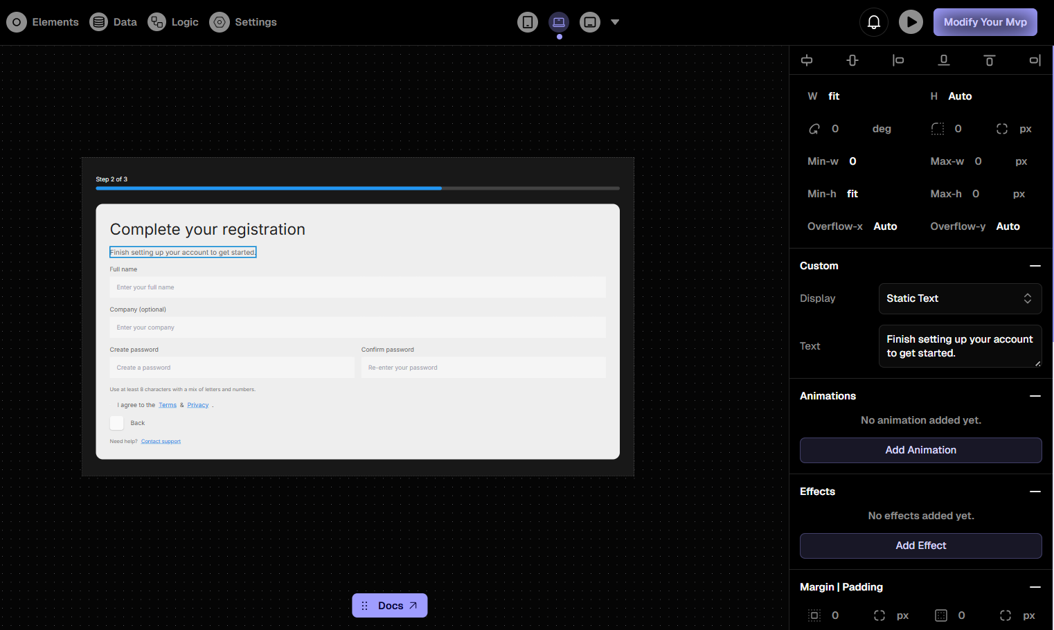
Whenever you select an element on the canvas or in the Layers panel, the **Right Panel** instantly becomes your **Properties Panel**. This is your contextual hub for controlling every aspect of the selected element's design.
 ***
## Mastering Responsive Design
The key to responsive design in Saasio is the set of device tabs at the top of the Properties Panel: **Desktop**, **Tablet**, and **Mobile**.
Saasio uses a "Desktop-First" approach. Styles you set on the **Desktop** tab will automatically cascade down to Tablet and Mobile. You can then override specific styles for smaller devices.
**Common Workflow:**
1. **Design for Desktop First:** Perfect your layout and styles in the **Desktop** tab.
2. **Adjust for Tablet:** Switch to the **Tablet** tab. Any style you change here will *only* affect the tablet view and smaller. For example, you might reduce the font size or change the layout direction.
3. **Optimize for Mobile:** Switch to the **Mobile** tab. Make final adjustments for the smallest screens, such as increasing button sizes for easier tapping or stacking elements vertically.
***
## Key Styling Properties
The Properties Panel is organized into collapsible sections to help you find the setting you need.
Control the size and spacing of your element. This includes `Width`,
`Height`, `Padding` (inner spacing), and `Margins` (outer spacing). You can
also manage complex layouts using `Flexbox` and `Grid` properties.
Define the visual look. This section includes `Background Color`, `Text
Color`, `Font Size`, `Font Weight`, `Borders`, and `Shadows`.
Manage the positioning of elements on the page. You can set an element's
position to be `relative`, `absolute`, or `fixed`, and adjust its `z-index`
to control its stacking order.
Apply visual transformations without affecting the layout, such as `Rotate`
and `Scale`.
***
## Mastering Responsive Design
The key to responsive design in Saasio is the set of device tabs at the top of the Properties Panel: **Desktop**, **Tablet**, and **Mobile**.
Saasio uses a "Desktop-First" approach. Styles you set on the **Desktop** tab will automatically cascade down to Tablet and Mobile. You can then override specific styles for smaller devices.
**Common Workflow:**
1. **Design for Desktop First:** Perfect your layout and styles in the **Desktop** tab.
2. **Adjust for Tablet:** Switch to the **Tablet** tab. Any style you change here will *only* affect the tablet view and smaller. For example, you might reduce the font size or change the layout direction.
3. **Optimize for Mobile:** Switch to the **Mobile** tab. Make final adjustments for the smallest screens, such as increasing button sizes for easier tapping or stacking elements vertically.
***
## Key Styling Properties
The Properties Panel is organized into collapsible sections to help you find the setting you need.
Control the size and spacing of your element. This includes `Width`,
`Height`, `Padding` (inner spacing), and `Margins` (outer spacing). You can
also manage complex layouts using `Flexbox` and `Grid` properties.
Define the visual look. This section includes `Background Color`, `Text
Color`, `Font Size`, `Font Weight`, `Borders`, and `Shadows`.
Manage the positioning of elements on the page. You can set an element's
position to be `relative`, `absolute`, or `fixed`, and adjust its `z-index`
to control its stacking order.
Apply visual transformations without affecting the layout, such as `Rotate`
and `Scale`.