> ## Documentation Index
> Fetch the complete documentation index at: https://docs.saasio.io/llms.txt
> Use this file to discover all available pages before exploring further.
# Text Element: Headings and Paragraphs
> Learn how to display static and dynamic text content using the Text element, including paragraphs and headings (H1, H2, etc.).
***
The Text element is a fundamental building block for displaying all written content in your application. You can use it to create everything from page titles and section headings (H1, H2, H3, etc.) to descriptive paragraphs and dynamic data-driven values.
### How to Add a Text Element
To add a Text element, find it in the "Elements" panel on the left and drag it onto your page.
### Configuring the Text Content
The content displayed by the Text element is controlled from the **Custom** section in the right-side properties panel. The most important property is **Display**, which determines the source of your text.
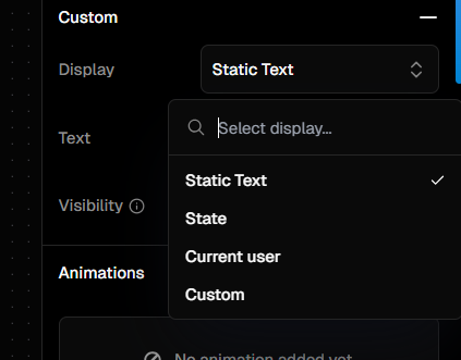 There are four ways to display text:
This is the most straightforward option. Choose this to type a fixed piece of text directly into the properties panel. The text will not change unless you edit it manually.
**Use Case:** Page titles, labels, instructions, or any content that doesn't need to be dynamic.
This option binds the Text element to a **State** variable you have created elsewhere in your application. Whenever the value of the state variable changes, the text displayed on the screen will automatically update to reflect the new value.
**Use Case:** Displaying a counter, showing the result of a calculation, or reflecting a selection made by the user.
This option connects the Text element to the current user's session data. You can select specific attributes to display, such as their name (`currentUser.user.name`), email (`currentUser.user.email`), or check their authentication status (`currentUser.status`).
**Use Case:** Greeting a logged-in user with "Welcome, John!", or displaying their email address in a profile section.
This provides the most flexibility by allowing you to use data binding to construct the text from any available data source. You can combine static text with dynamic data from states, APIs, or other elements.
**Use Case:** Creating complex strings like `You have {{cart.items.length}} items in your cart` or formatting data in a specific way before displaying it.
### Accessing the Element's Value
The **Element's Value** for a Text element is its current rendered text content.
No matter which display source you use (Static, State, etc.), the final string that appears on the screen is exposed as the element's value. You can access this value from other elements by using the `Element Value` data source and selecting the Text element.
**Use Case:** Imagine you have a dynamic text element named `greetingText`. You could create another text element to display its character count with a custom binding like: `Character count: {{greetingText.value.length}}`.
### Element Type (Headings and Paragraphs)
For semantic HTML and good SEO, it's important to use the correct HTML tag for your text. In the properties panel, you can select the **HTML Tag** for the element, such as:
* **`H1`**: For the main page title (use only one per page).
* **`H2`, `H3`**: For section and sub-section headings.
* **`P`**: For standard paragraphs of text.
### Styling
You can fully customize the appearance of your Text element from the right-side panel. Common styling options include:
* **Font**: Set the font family, size, and color.
* **Weight**: Choose from options like normal, medium, semi-bold, and bold.
* **Alignment**: Align the text to the left, center, right, or justified.
* **Decorations**: Add styles like underline or strikethrough.\`\`\`
### Dynamic Visibility
You can show or hide a Text element based on certain conditions. This is controlled by the **Visibility** property found in the **Custom** section of the right-side panel.
This field accepts a boolean value (`true` or `false`). You can bind this to any data source that resolves to a boolean. When the value is `true`, the element is visible. When it is `false`, the element is hidden.
**Example:** To show a success message only after a user has logged in, you could set the Visibility property of your "Login successful!" text element if `{{currentUser.status}}` is `authenticated`.
There are four ways to display text:
This is the most straightforward option. Choose this to type a fixed piece of text directly into the properties panel. The text will not change unless you edit it manually.
**Use Case:** Page titles, labels, instructions, or any content that doesn't need to be dynamic.
This option binds the Text element to a **State** variable you have created elsewhere in your application. Whenever the value of the state variable changes, the text displayed on the screen will automatically update to reflect the new value.
**Use Case:** Displaying a counter, showing the result of a calculation, or reflecting a selection made by the user.
This option connects the Text element to the current user's session data. You can select specific attributes to display, such as their name (`currentUser.user.name`), email (`currentUser.user.email`), or check their authentication status (`currentUser.status`).
**Use Case:** Greeting a logged-in user with "Welcome, John!", or displaying their email address in a profile section.
This provides the most flexibility by allowing you to use data binding to construct the text from any available data source. You can combine static text with dynamic data from states, APIs, or other elements.
**Use Case:** Creating complex strings like `You have {{cart.items.length}} items in your cart` or formatting data in a specific way before displaying it.
### Accessing the Element's Value
The **Element's Value** for a Text element is its current rendered text content.
No matter which display source you use (Static, State, etc.), the final string that appears on the screen is exposed as the element's value. You can access this value from other elements by using the `Element Value` data source and selecting the Text element.
**Use Case:** Imagine you have a dynamic text element named `greetingText`. You could create another text element to display its character count with a custom binding like: `Character count: {{greetingText.value.length}}`.
### Element Type (Headings and Paragraphs)
For semantic HTML and good SEO, it's important to use the correct HTML tag for your text. In the properties panel, you can select the **HTML Tag** for the element, such as:
* **`H1`**: For the main page title (use only one per page).
* **`H2`, `H3`**: For section and sub-section headings.
* **`P`**: For standard paragraphs of text.
### Styling
You can fully customize the appearance of your Text element from the right-side panel. Common styling options include:
* **Font**: Set the font family, size, and color.
* **Weight**: Choose from options like normal, medium, semi-bold, and bold.
* **Alignment**: Align the text to the left, center, right, or justified.
* **Decorations**: Add styles like underline or strikethrough.\`\`\`
### Dynamic Visibility
You can show or hide a Text element based on certain conditions. This is controlled by the **Visibility** property found in the **Custom** section of the right-side panel.
This field accepts a boolean value (`true` or `false`). You can bind this to any data source that resolves to a boolean. When the value is `true`, the element is visible. When it is `false`, the element is hidden.
**Example:** To show a success message only after a user has logged in, you could set the Visibility property of your "Login successful!" text element if `{{currentUser.status}}` is `authenticated`.