> ## Documentation Index
> Fetch the complete documentation index at: https://docs.saasio.io/llms.txt
> Use this file to discover all available pages before exploring further.
# Exploring the Visual Editor
> A detailed tour of the Saasio Visual Editor. Learn about the canvas, panels, and the primary tools you'll use to build your SaaS application.
***
The Saasio Visual Editor is the heart of the platform. It's an all-in-one workspace where you will design your user interface, manage your app's data, build workflows, and configure settings.
Understanding its layout is the key to building quickly and efficiently.
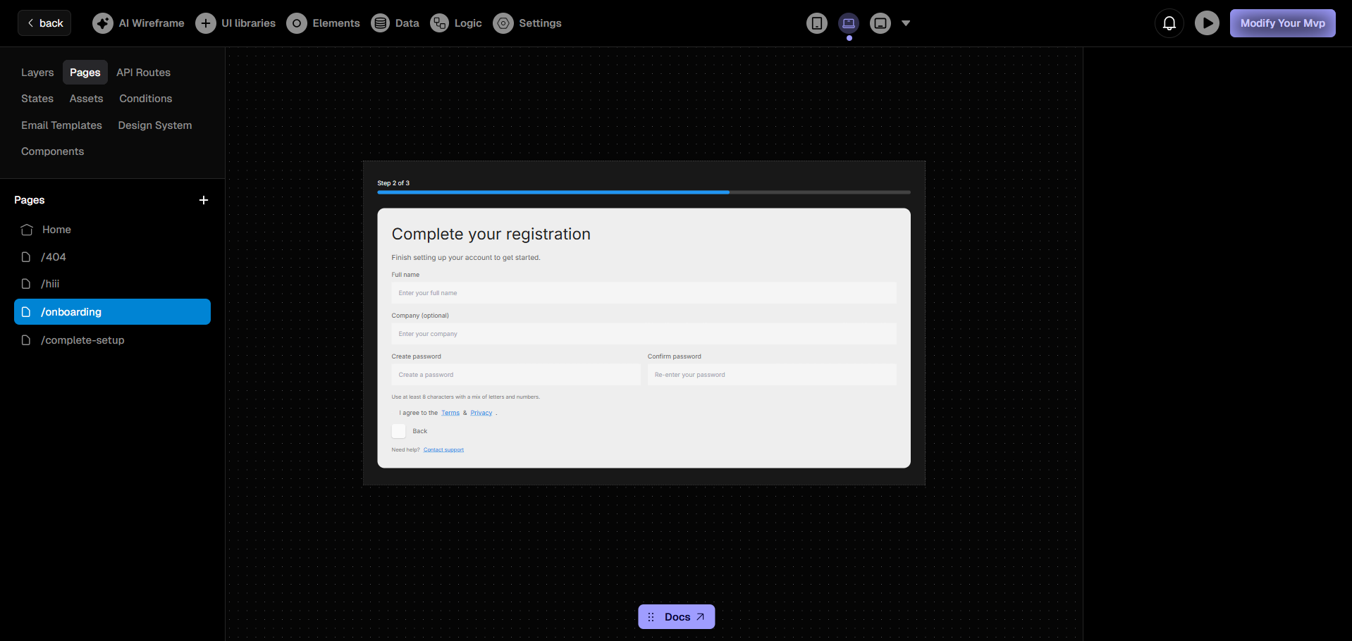 The editor is divided into four main areas:
***
## Top Navigation Bar: Quick Actions
The top bar is your primary toolkit for building your application. It provides direct access to every major function you'll need, from designing the UI to deploying your project.
Generate entire page layouts and components instantly from a simple text
prompt.
Access pre-built, professional components from
[Shadcn](https://ui.shadcn.com/), [Magic UI](https://magicui.design/), and
[Aceternity UI](https://ui.aceternity.com/) , etc.
Add fundamental building blocks like text, containers, images, and forms to
your page.
Manage your database tables, create form schemas, and connect to any
external API, etc.
Define the step-by-step workflows and actions that power your application's
interactivity.
Configure app-level settings such as your custom domain, SEO, and
integrations.
Instantly check your design's responsiveness across desktop, tablet, and
mobile screens.
Preview, publish, and manage your application's live deployments with a
single click.
***
## Left Panel: Project Structure
The left panel is your command center for managing the assets, logic, and overall structure of your application. It contains several powerful tabs for different functions.
Create new pages, organize them into folders, and navigate between the
different screens of your application.
Define backend API endpoints to handle server-side logic, interact with your
database, or connect to external services.
View the complete hierarchy of all UI elements on the current page. Select,
reorder, and manage elements from this view.
Create your own reusable UI components. Build a component once and use it
anywhere across your application to maintain consistency.
Manage your app's data. Create **State** variables for storing temporary
data and upload **Assets** like images, videos, and files.
Define powerful rules to dynamically change how elements look and behave
based on application state or user interaction.
Let the AI generate a complete design system for your app, including color
palettes and typography for both light and dark themes.
Design and manage professional, reusable email templates for transactional
emails, notifications, and marketing campaigns.
***
## Central Canvas: Your Workspace
The canvas is the large, interactive area in the center of the editor. This is your main building space.
* **Visual Building:** Drag and drop elements from the UI Libraries and Elements tabs directly onto the canvas.
* **Direct Manipulation:** Click, resize, and rearrange elements to create your desired layout.
* **Live Preview:** The canvas provides a real-time preview of what your page will look like.
***
## Right Panel: Properties & Styling
The right panel is your contextual toolkit for fine-tuning every element. When you select a component on the canvas, this panel dynamically updates to show all of its available settings.
This is where you control how your elements look, feel, and behave across different screen sizes.
Adjust visual styles like colors, backgrounds, fonts, borders, and shadows
to match your brand.
Control the element's size, spacing (padding and margins), and exact
positioning on the page.
Configure element-specific properties, such as the URL for a link or the
validation rules for a form input.
Bring your UI to life with production-grade animations powered by
[motion.dev](https://motion.dev) (formerly Framer Motion). Customize how
elements appear and respond to user interaction.
The editor is divided into four main areas:
***
## Top Navigation Bar: Quick Actions
The top bar is your primary toolkit for building your application. It provides direct access to every major function you'll need, from designing the UI to deploying your project.
Generate entire page layouts and components instantly from a simple text
prompt.
Access pre-built, professional components from
[Shadcn](https://ui.shadcn.com/), [Magic UI](https://magicui.design/), and
[Aceternity UI](https://ui.aceternity.com/) , etc.
Add fundamental building blocks like text, containers, images, and forms to
your page.
Manage your database tables, create form schemas, and connect to any
external API, etc.
Define the step-by-step workflows and actions that power your application's
interactivity.
Configure app-level settings such as your custom domain, SEO, and
integrations.
Instantly check your design's responsiveness across desktop, tablet, and
mobile screens.
Preview, publish, and manage your application's live deployments with a
single click.
***
## Left Panel: Project Structure
The left panel is your command center for managing the assets, logic, and overall structure of your application. It contains several powerful tabs for different functions.
Create new pages, organize them into folders, and navigate between the
different screens of your application.
Define backend API endpoints to handle server-side logic, interact with your
database, or connect to external services.
View the complete hierarchy of all UI elements on the current page. Select,
reorder, and manage elements from this view.
Create your own reusable UI components. Build a component once and use it
anywhere across your application to maintain consistency.
Manage your app's data. Create **State** variables for storing temporary
data and upload **Assets** like images, videos, and files.
Define powerful rules to dynamically change how elements look and behave
based on application state or user interaction.
Let the AI generate a complete design system for your app, including color
palettes and typography for both light and dark themes.
Design and manage professional, reusable email templates for transactional
emails, notifications, and marketing campaigns.
***
## Central Canvas: Your Workspace
The canvas is the large, interactive area in the center of the editor. This is your main building space.
* **Visual Building:** Drag and drop elements from the UI Libraries and Elements tabs directly onto the canvas.
* **Direct Manipulation:** Click, resize, and rearrange elements to create your desired layout.
* **Live Preview:** The canvas provides a real-time preview of what your page will look like.
***
## Right Panel: Properties & Styling
The right panel is your contextual toolkit for fine-tuning every element. When you select a component on the canvas, this panel dynamically updates to show all of its available settings.
This is where you control how your elements look, feel, and behave across different screen sizes.
Adjust visual styles like colors, backgrounds, fonts, borders, and shadows
to match your brand.
Control the element's size, spacing (padding and margins), and exact
positioning on the page.
Configure element-specific properties, such as the URL for a link or the
validation rules for a form input.
Bring your UI to life with production-grade animations powered by
[motion.dev](https://motion.dev) (formerly Framer Motion). Customize how
elements appear and respond to user interaction.