The Table element is a powerful tool for presenting data in a clear and organized manner within your Saasio application. It allows you to structure information in a grid of rows and columns, making it easy for your users to scan, compare, and understand the data you’re presenting.
How to Add a Table
To add a Table element to your page, simply drag it from the “UI Libraries” panel. You can find the Table element under the Shadcn UI section on the left-hand side of the editor.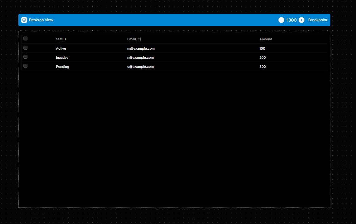
Managing Table Columns
You can define the structure and behavior of your table by configuring its columns. This is done in the Custom section of the right-side properties panel, using thecolumns property.
The columns property accepts an array of objects, where each object defines a single column in your table.
Here is a basic example of a columns configuration:
Column Properties Explained
Each column object follows theTtableColumn type definition and can have the following properties:
-
headerName(Required): A string that defines the title displayed in the column’s header (Must lowercase). -
sortHeader(Optional): Enables sorting on this column. You can set the initial sorting direction to"asc"for ascending or"desc"for descending. When a user clicks the header, the sort order will toggle. -
cell(Optional): An object that allows you to customize how the data within each cell of the column is rendered and formatted.
Customizing Cells
Thecell object gives you fine-grained control over the appearance and functionality of your table cells.
-
formatCell: Automatically format numerical data."decimal": Formats the number as a decimal."currency": Formats the number as a currency value. You must also provide thecurrencyproperty."percent": Displays the number as a percentage.
-
currency: When usingformatCell: "currency", you must specify the currency symbol or code (e.g., “USD”, “EUR”). -
reusableComponentName: Instead of displaying simple text, you can render a reusable component you’ve already created within a cell. Simply enter the name of your component as a string. -
props: When using areusableComponentName, you can pass data to it using thepropsobject. This allows you to create dynamic and interactive cells. There are two special string values you can use within thepropsobject to pass data from the table to your component:"[current_cell]": This value is replaced with the data for the specific cell being rendered."[current_row]": This value is replaced with the entire data object for the row that the cell belongs to.
statusTextprop. You could configure your column like this:In this example, for each row, the “StatusBadge” component will be rendered. The value of thestatuscell for that row will be passed to the component’sstatusTextprop.
Accessing Table Data
You can access various properties and data sets from your Table element to use in other parts of your application. This is useful for displaying statistics (like the total number of items), building custom external pagination controls, or performing actions on selected rows. To access this data, create a new Data Source and configure it as follows:- Set the Data source type to
Element Value. - In the Select element dropdown, choose your table (e.g.,
Shadcn-table). - A final dropdown will appear, allowing you to select which specific piece of data you want to access from the table.
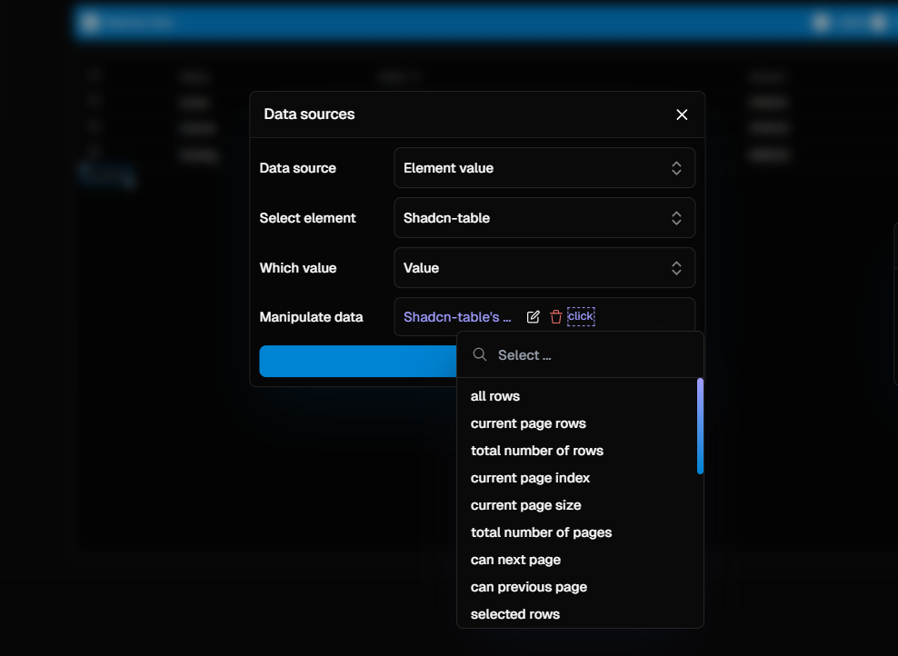
Available Data Properties
Here is a complete list of the data you can retrieve from a Table element. Each property can be accessed via theElement Value data source.
An array containing all the row data objects in the table, ignoring any
filtering or pagination.
An array containing the row data objects that are currently visible on the
active page.
A number representing the total count of rows in the dataset before
pagination.
The index of the current page, starting from
0.A number indicating how many rows are displayed per page.
The total number of pages calculated from the total rows and the page size.
A boolean value that is
true if a next page exists. This is useful for
dynamically enabling or disabling a “Next” button.A boolean value that is
true if a previous page exists. This is useful for
dynamically enabling or disabling a “Previous” button.An array containing the data objects for all rows that the user has selected.
This requires row selection to be enabled on the table.
An array of all row data objects that match the current filter criteria,
ignoring pagination.
Table Actions
You can programmatically control the table’s state and behavior from any workflow, such as a button click or a page load event. This allows you to build custom controls for filtering, pagination, sorting, and more. To control the table, add an action to your workflow and select “Trigger Table Action”. You will then be prompted to choose the target table and the specific action you want to perform.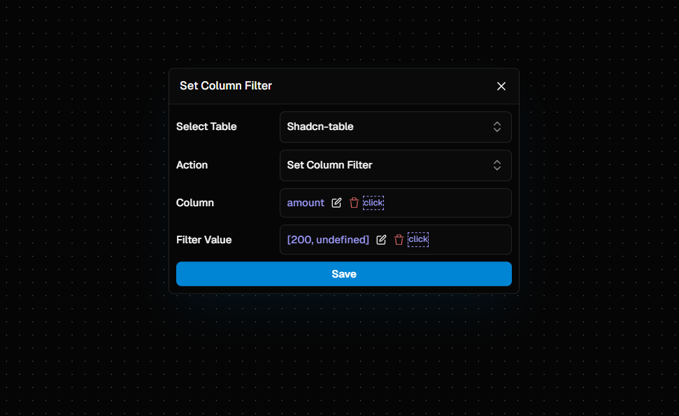
Available Actions
You can programmatically control the table from any workflow. Here is a complete list of the actions you can trigger on a Table element, presented as a collapsible list.Clear All Filters
Clear All Filters
Clears all filters currently applied to the table. Parameters: None
Reset Table
Reset Table
Resets the table to its initial state, clearing all filters, sorting, and
column order changes. Parameters: None
Clear Column Filter
Clear Column Filter
Clears the filter that has been applied to a single, specified column.
Parameters: -
Column (string): The headerName (lowercase) of the
column to clear the filter from.Clear Sorting
Clear Sorting
Removes all sorting applied to the table’s columns. Parameters: None
Next Page
Next Page
Navigates to the next page of the table. Parameters: None
Previous Page
Previous Page
Navigates to the previous page of the table. Parameters: None
Reset Column Order
Reset Column Order
Resets the order of all columns back to their default state. Parameters:
None
Set Column Filter
Set Column Filter
Sets or updates a filter value for a specific column. Parameters: -
Column (string): The headerName (lowercase) of the column to filter. -
Filter Value (any): The value to filter the column by.Set Column Order
Set Column Order
Moves a column to a specific position (index) in the table. Parameters:
Column(string): TheheaderName(lowercase) of the column to reorder.Index(number): The new zero-based index for the column.
Set Page Index
Set Page Index
Navigates directly to a specific page in the table. Parameters: -
Page Index (number): The index of the page to navigate to (e.g., 0 for the
first page).Set Page Size
Set Page Size
Changes the number of rows displayed on each page. Parameters: -
Page Size (number): The number of rows to show per page.Sort Column
Sort Column
Applies sorting to a specific column. Parameters: -
Column (string):
The headerName (lowercase) of the column to sort. - Descending
(boolean): Set to true for descending order or false for ascending
order.Toggle Column Visibility
Toggle Column Visibility
Shows or hides a specific column. Parameters: -
Column (string): The
headerName (lowercase) of the column to toggle.Filtering Examples
TheSet Column Filter action is versatile. The behavior of the filter depends on the Filter Value you provide. Here are some common scenarios and how to configure them.
- Text Filtering
- Number / Date Range Filtering
- Clearing a Filter
Use Case: You have a search input field where users can type to filter a “Name” column.
Action Configuration:- Column:
Name - Filter Value: Bind this to the value of your search input element.