So far, you’ve learned how to build a beautiful, static interface. Now, it’s time to make it intelligent and interactive. This is done using two core features: State and Conditions.
- State: Think of State as the temporary memory for your page. It’s where you store data that can change, such as user input, loading indicators, or data fetched from an API.
- Conditions: Conditions allow your UI elements to react to changes in State. They follow a simple “IF-THEN” logic: IF a certain condition is true, THEN change an element’s appearance or value.
Part 1: Storing Data with State
A “state variable” is a container for a piece of data. In Saasio, states are always attached to a specific context: either to a UI element on a Page or to the API Route itself.State on a Page
On a page, states are scoped to an element. This means you first select the element that will “own” the state, like a container or the main body of the page.1. Select the Host Element
First, select the element that will hold your state variable. For page-wide states, it’s common practice to select the top-level
Body element in the Layers panel.2. Navigate to the States Tab
With the element selected, go to the left panel and click on the States
tab. This will show a list of all state variables attached to that element.
Configuring Your State Variable
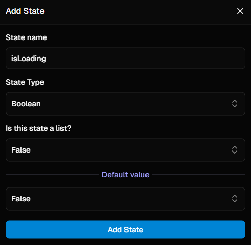
After clicking the+ icon, a dialog will appear. Here’s a breakdown of each field you need to configure:
A descriptive, user-friendly name for your variable (e.g.,
isLoading or
userList).The type of data this variable will hold. This can be:
- A simple type like
Text,Number, orBoolean. - A Data Table (e.g.,
Users) for storing complex objects. - An Option Set for storing a value from a predefined list of choices.
Defines if the state holds a single value or a list of values. This defaults
to
false.The initial value when the page loads. This should match the data type (e.g.,
false for a Boolean, or empty for a list).Configuration Examples
Here’s how you would configure two common types of state variables:- Example 1: Single Boolean State
- Example 2: List of Users State
This state holds a single
true or false value, perfect for tracking a loading status.- Name:
isLoading - Data Type:
Boolean - Is List?:
false(or leave as default) - Default Value:
false
State in an API Route
In an API Route, states are attached globally to the route itself, as there is no UI. The process is simpler:- With your API Route open, navigate to the States tab in the left panel.
- Click the
+icon and configure your state variable using the same properties described above.
Part 2: Displaying State in Your UI (Data Binding)
You can “bind” an element’s property to a state variable, so it always displays the current value. For example, to display the value of a state variable in a text element:- Select the Text element on your canvas.
- In the Properties Panel (right side), find the
Displayproperty. - Change its value from “static text” to “state”.
- In the
Data sourcefield that appears, select your desired state variable.
Part 3: Using Conditions to React to State
Conditions allow elements to change their appearance or content when your state changes. Let’s make a “Submit” button change its text to “Saving…” when ourisLoading state is true.
1. Select the Target Element
First, select the element you want to change. In this case, it’s the Text element that is inside our button.
3. Add and Configure a Condition
Click the You can make two types of changes:
+ icon to add a new condition. A configuration panel will appear. Here, you define a rule that checks if something is true, and then specify how the element should change in response.1. Define the Condition
First, you must define the logic. In thecondition section, build a dynamic expression that results in a true or false value.Example: To track a loading state, you would select the isLoading state variable and add an operation to check if its value is equal to true.2. Configure the Changes (When the Condition is True)
Next, you specify how the element should look or what it should contain only when the condition you just defined is true.When the condition is
false, the element automatically reverts to its
original, default properties and styles. You do not need to define a “false”
state.-
Change the Primary Value:
In the
propertiessection, you can override the element’s main content. For our text element, you would set thevaluesproperty to the new text you want: “Saving…”. -
Change the Style:
In the
stylessection, you can add one or more CSS style overrides. For example, you could change the button’sbackgroundColorto a muted grey to show it’s in a loading state.
isLoading state becomes true, the button’s text will automatically change to “Saving…”. When it becomes false, it will revert to its original state.